manage cookies
cookie settings
Privacy choices at The Harvest Studio. Customise your privacy. You can enable or disable different categories of cookies below. Technically necessary cookies cannot be deactivated as they ensure the basic functionality of our studio website. Cookies are stored for a maximum of 24 months.
SÁVE
Naming & Logo,
Packaging design,
Media production
& art direction
Naming & Logo,
Packaging design,
Media production
& art direction
superfood
healthy brand
healthy brand
project
003
003
Save
client :
2020
creative field :
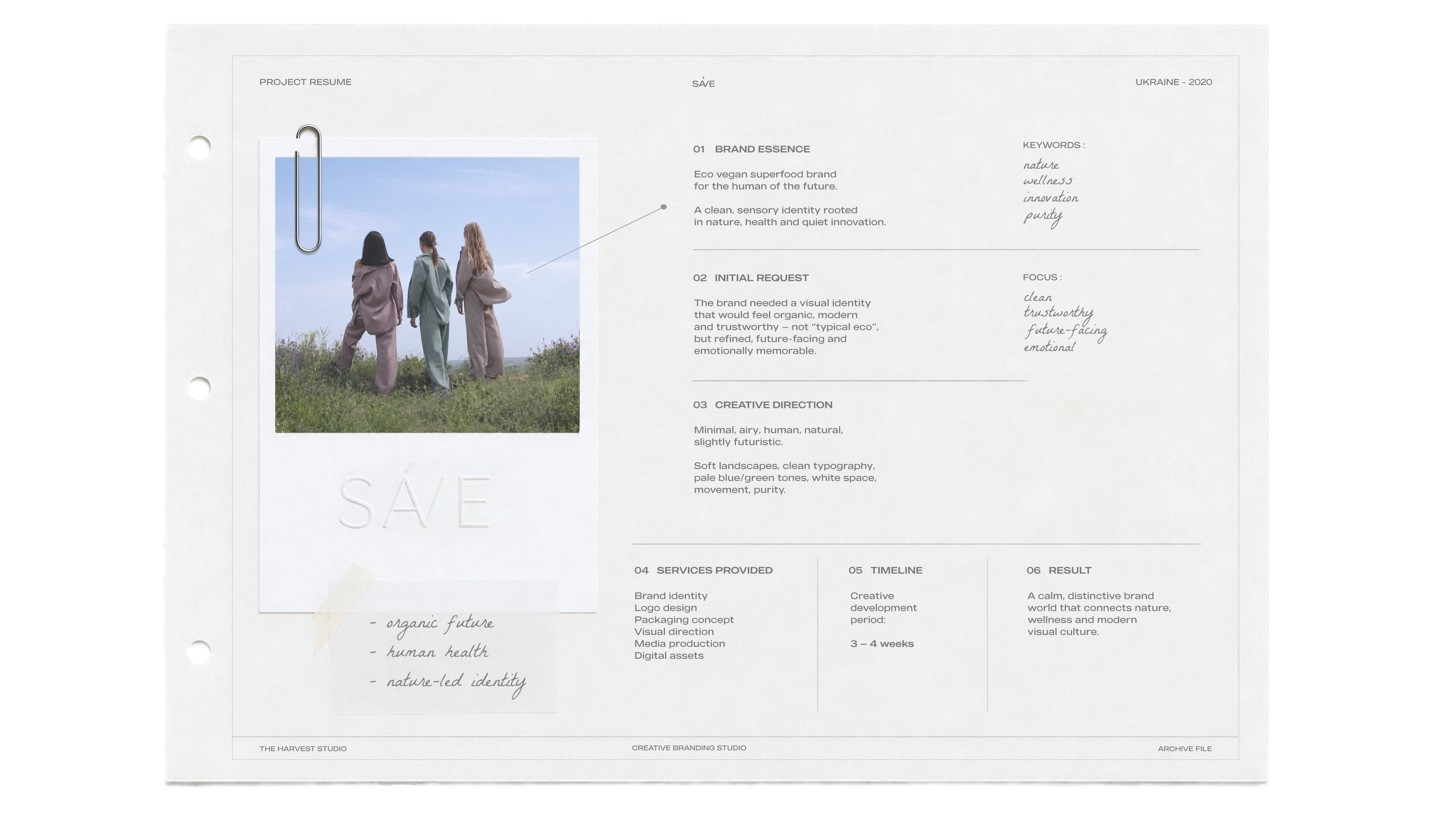
SÁVE is a premium superfood brand born from a profound respect for the natural world and the human body.
At its core lies a simple but powerful manifesto: to nourish, protect, and consciously preserve the delicate balance between our health and the planet's future.
Our studio was entrusted with creating a holistic brand identity from the ground up. We developed a visual language rooted in quiet luxury and purity, capturing the brand's organic essence through cinematic, analog-inspired art direction and a highly refined, minimalist design system.
At its core lies a simple but powerful manifesto: to nourish, protect, and consciously preserve the delicate balance between our health and the planet's future.
Our studio was entrusted with creating a holistic brand identity from the ground up. We developed a visual language rooted in quiet luxury and purity, capturing the brand's organic essence through cinematic, analog-inspired art direction and a highly refined, minimalist design system.
SÁVE
Naming & Logo,
Packaging design,
Media production
& art direction
Naming & Logo,
Packaging design,
Media production
& art direction
superfood
healthy brand
healthy brand
project
003
003
Save
client :
2020
creative field :
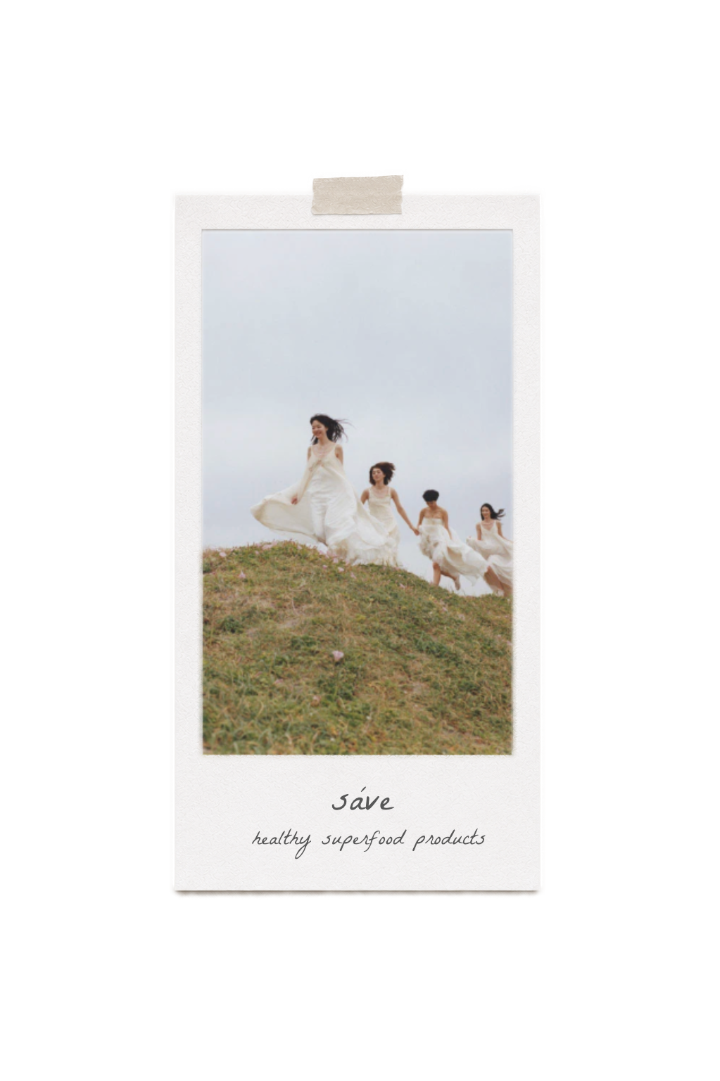
SÁVE is a premium superfood brand born from a profound respect for the natural world and the human body.
At its core lies a simple but powerful manifesto: to nourish, protect, and consciously preserve the delicate balance between our health and the planet's future.
Our studio was entrusted with creating a holistic brand identity from the ground up. We developed a visual language rooted in quiet luxury and purity, capturing the brand's organic essence through cinematic, analog-inspired art direction and a highly refined, minimalist design system.
At its core lies a simple but powerful manifesto: to nourish, protect, and consciously preserve the delicate balance between our health and the planet's future.
Our studio was entrusted with creating a holistic brand identity from the ground up. We developed a visual language rooted in quiet luxury and purity, capturing the brand's organic essence through cinematic, analog-inspired art direction and a highly refined, minimalist design system.
описание
2 услуга - создание упаковки продукта
описание
главное видео
мудборд
результат
фото как на доске приколоты
видео1
видео2
видео3
3 услуга - медиа продакшн
The naming of SÁVE stems from the brand's core manifesto: the conscious preservation of nature, the human body, and the future of the planet.
This philosophy is seamlessly translated into the clean, architectural typography of the logotype, where every detail serves a specific purpose
This philosophy is seamlessly translated into the clean, architectural typography of the logotype, where every detail serves a specific purpose
project resume
01

What if we did branding for this project in 2026?
naming & logotype
Semantic foundation: The name inherently
conveys the concept of protection and care (to save), encapsulated within a refined, minimalist form.
conveys the concept of protection and care (to save), encapsulated within a refined, minimalist form.
Structural fusion: The central letters 'A' and 'V' are unified by a shared diagonal stroke. This acts as a visual metaphor for a connection between humanity and the natural world.
Structural fusion: The central letters 'A' and 'V' is unified by a shared diagonal stroke.
Semantic foundation: The name inherently
conveys the concept of protection and care (to save), encapsulated within a refined, minimalist form.
conveys the concept of protection and care (to save), encapsulated within a refined, minimalist form.
media production & art direction
packaging design


The naming of SÁVE stems from the brand's core manifesto: the conscious preservation of nature, the human body, and the future of the planet.
This philosophy is seamlessly translated into the clean, architectural typography of the logotype, where every detail serves a specific purpose
This philosophy is seamlessly translated into the clean, architectural typography of the logotype, where every detail serves a specific purpose
To translate SÁVE’s philosophy into a physical experience, we developed a visual language rooted in cinematic naturalism. The art direction captures the unbreakable connection between human nature and the earth.
We prioritized authentic storytelling and tactile aesthetics to create an
emotionally immersive, breathable brand environment.
We prioritized authentic storytelling and tactile aesthetics to create an
emotionally immersive, breathable brand environment.
media production & art direction
packaging design
The naming of SÁVE stems from the brand's core manifesto: the conscious preservation of nature, the human body, and the future of the planet.
This philosophy is seamlessly translated into the clean, architectural typography of the logotype, where every detail serves a specific purpose
This philosophy is seamlessly translated into the clean, architectural typography of the logotype, where every detail serves a specific purpose
To translate SÁVE’s philosophy into a physical experience, we developed a visual language rooted in cinematic naturalism. The art direction captures the unbreakable connection between human nature and the earth.
We prioritized authentic storytelling and tactile aesthetics to create an
emotionally immersive, breathable brand environment.
We prioritized authentic storytelling and tactile aesthetics to create an
emotionally immersive, breathable brand environment.
media production & art direction
To translate SÁVE’s philosophy
into a physical experience, we developed a visual language
rooted in cinematic naturalism.
The art direction captures the unbreakable connection between human nature and the earth.
We prioritized authentic storytelling and tactile aesthetics to create an emotionally immersive, breathable brand environment.
into a physical experience, we developed a visual language
rooted in cinematic naturalism.
The art direction captures the unbreakable connection between human nature and the earth.
We prioritized authentic storytelling and tactile aesthetics to create an emotionally immersive, breathable brand environment.
Art direction: Rooted in soft minimalism.
Blending organic shapes with elevated, future-facing editorial aesthetics.
Blending organic shapes with elevated, future-facing editorial aesthetics.
mood board
Media production: A tactile visual language. Driven by natural light, wind, and the raw beauty of human touch.
Art direction: Rooted in soft minimalism.
Blending organic shapes with elevated, future-facing editorial aesthetics.
Blending organic shapes with elevated, future-facing editorial aesthetics.
mood board
Media production: A tactile visual language. Driven by natural light, wind, and the raw beauty of human touch.
01 pineapple
02 matcha
03 strawberry
00 main intro video
01 pineapple
02 matcha
03 strawberry
00 main intro video

Functional Superfood Brand
A complete reimagining of a functional
superfood brand through contemporary
identity, packaging and campaign design.
superfood brand through contemporary
identity, packaging and campaign design.
Reimagined for 2026
What if...
...we designed this brand today?
We opened our archives to reimagine the past.
Discover how this identity breathes today through our 2026 visual lens.
Discover how this identity breathes today through our 2026 visual lens.

name
tell me about your growing ambitions
project
ready to elevate your brand?
Share the essence of your project with us.
Let’s collaborate to build a visual language that feels timeless and deeply immersive.
Let’s collaborate to build a visual language that feels timeless and deeply immersive.
individual request
01
name
tell me about your growing ambitions
project

ready to elevate your brand?
If the existing stages don’t fully reflect your vision, we can shape a custom growth path together.
Share the essence of your project with us.
Let’s collaborate to build a visual language that feels timeless and deeply immersive.
Let’s collaborate to build a visual language that feels timeless and deeply immersive.
individual request
01