
manage cookies
cookie settings
Privacy choices at The Harvest Studio. Customise your privacy. You can enable or disable different categories of cookies below. Technically necessary cookies cannot be deactivated as they ensure the basic functionality of our studio website. Cookies are stored for a maximum of 14 months.
SÁVE
Packaging design,
AI media production
& art direction
Packaging design,
AI media production
& art direction
superfood
healthy brand
healthy brand
project
003
003

Save
client :
2026
creative field :
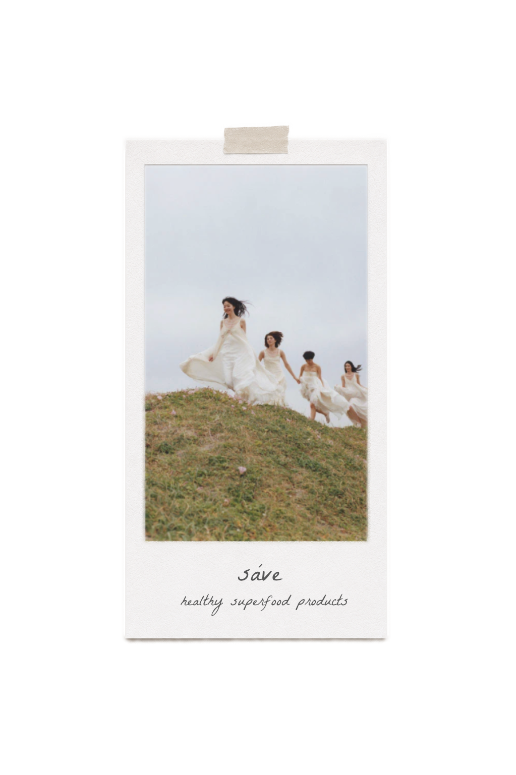
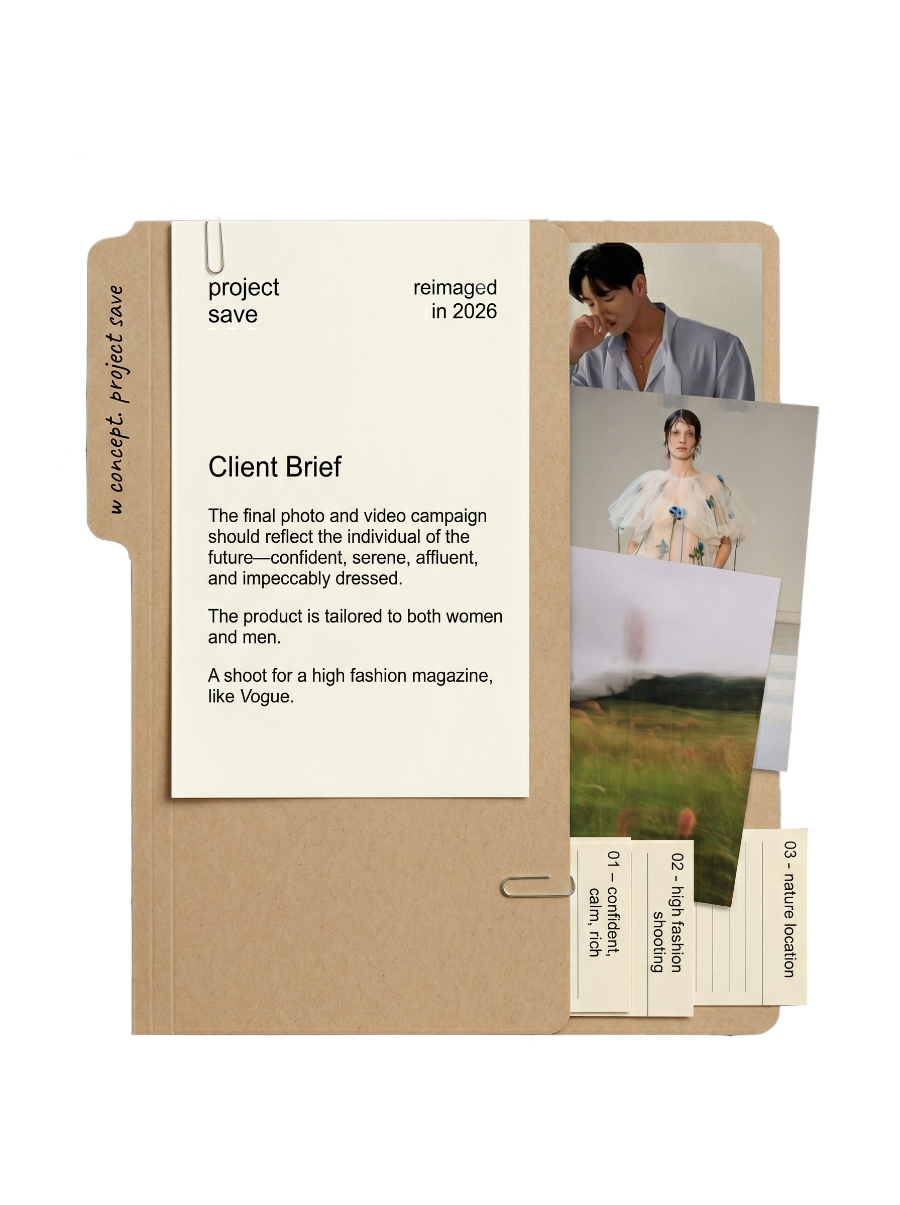
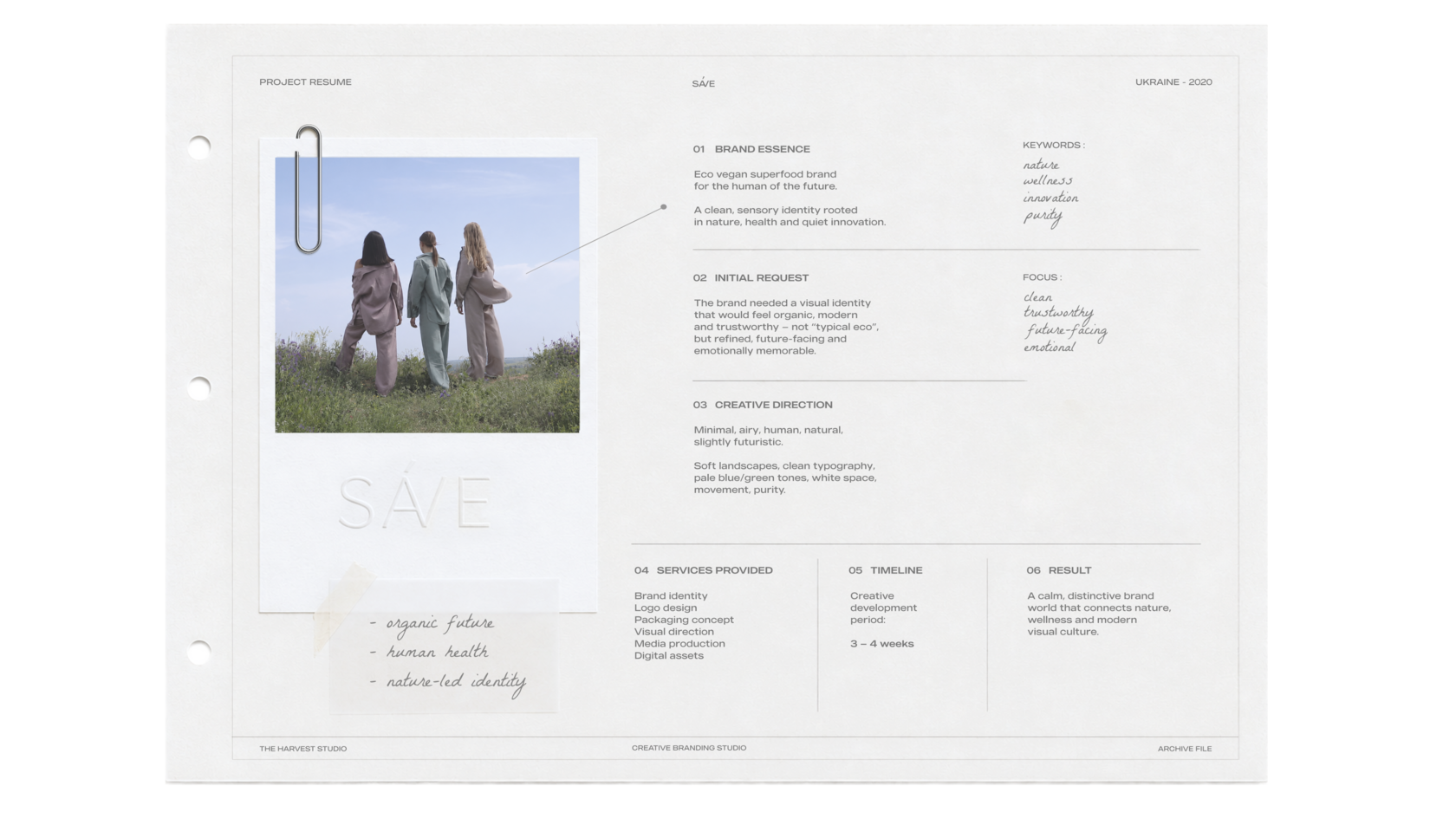
SÁVE is a premium superfood brand born from a profound respect for the natural world and the human body.
At its core lies a simple but powerful manifesto: to nourish, protect, and consciously preserve the delicate balance between our health and the planet's future.
Our studio was entrusted with creating a holistic brand identity from the ground up. We developed a visual language rooted in quiet luxury and purity, capturing the brand's organic essence through cinematic, analog-inspired art direction and a highly refined, minimalist design system.

SÁVE
Packaging design,
AI media production
& art direction
Packaging design,
AI media production
& art direction
superfood
healthy brand
healthy brand
project
003
003
Save
client :
2026
creative field :
SÁVE is a premium superfood brand born from a profound respect for the natural world and the human body.
At its core lies a simple but powerful manifesto: to nourish, protect, and consciously preserve the delicate balance between our health and the planet's future.
Our studio was entrusted with creating a holistic brand identity from the ground up.
We developed a visual language rooted in quiet luxury and purity, capturing the brand's organic essence through cinematic, analog-inspired art direction and a highly refined, minimalist design system.


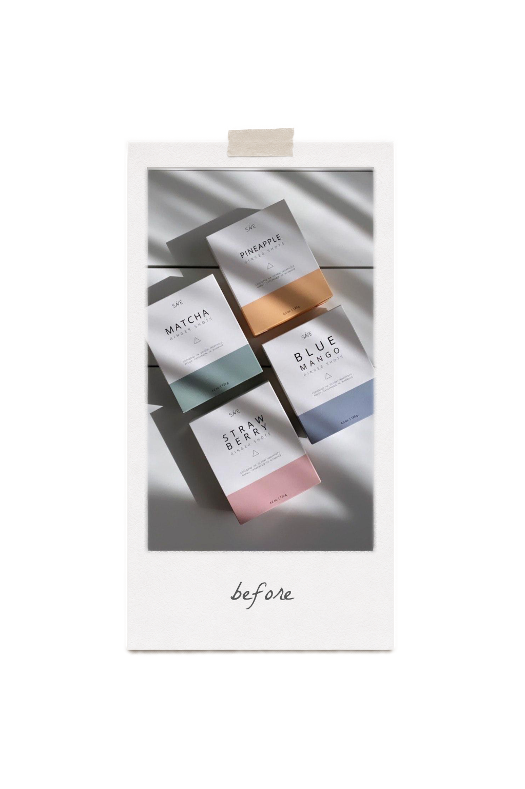
What if...
... we launched this brand today?
SÁVE initially launched as a forward-thinking functional supplement rooted in ginger, superfoods, and clean, natural ingredients.
Six years on, visual culture has shifted dramatically.
This case study explores the rebirth of the brand—reimagined through a contemporary lens for a new era of conscious living.
Six years on, visual culture has shifted dramatically.
This case study explores the rebirth of the brand—reimagined through a contemporary lens for a new era of conscious living.
01
menu
05
06
02
03
04
07
08
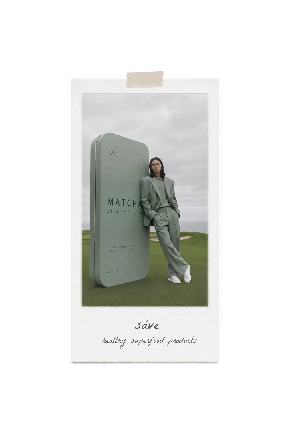
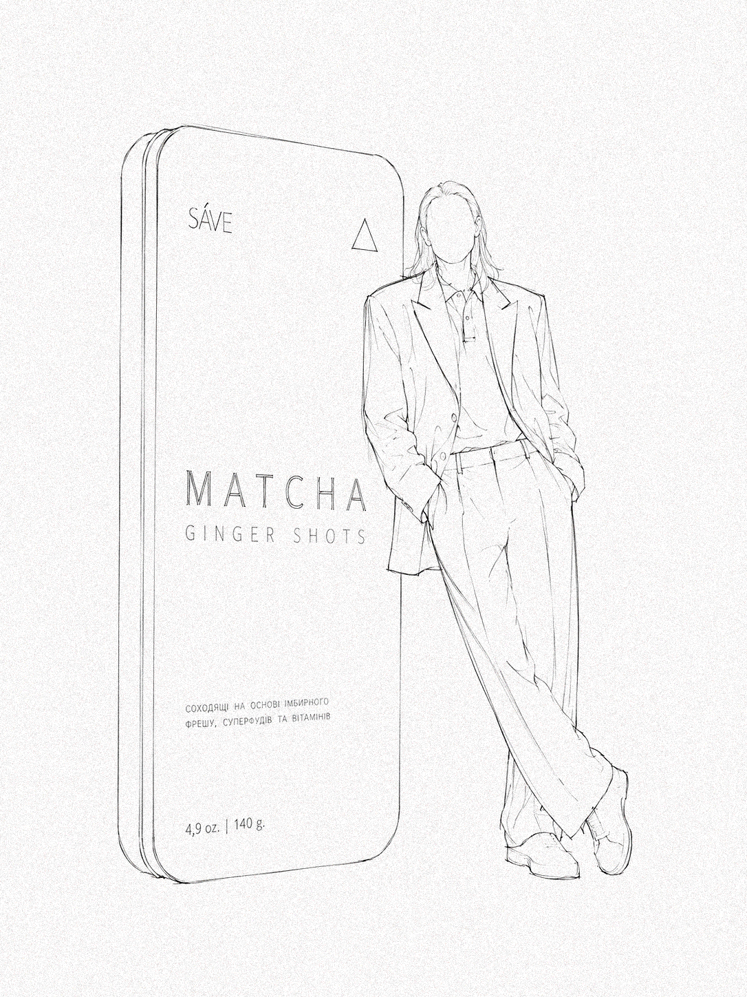
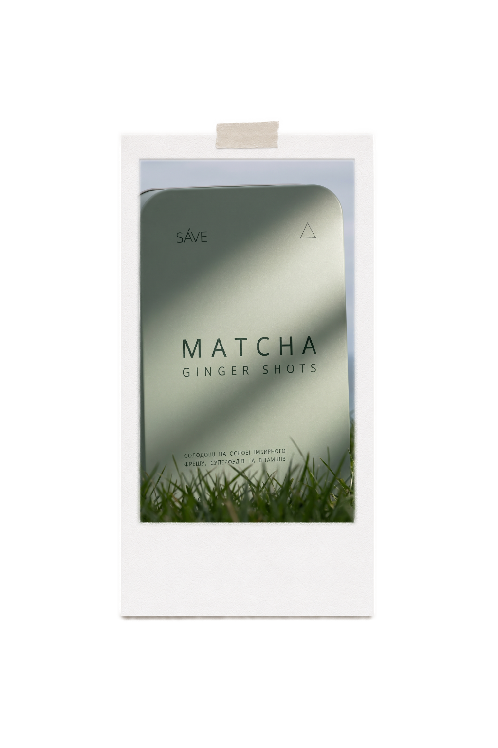
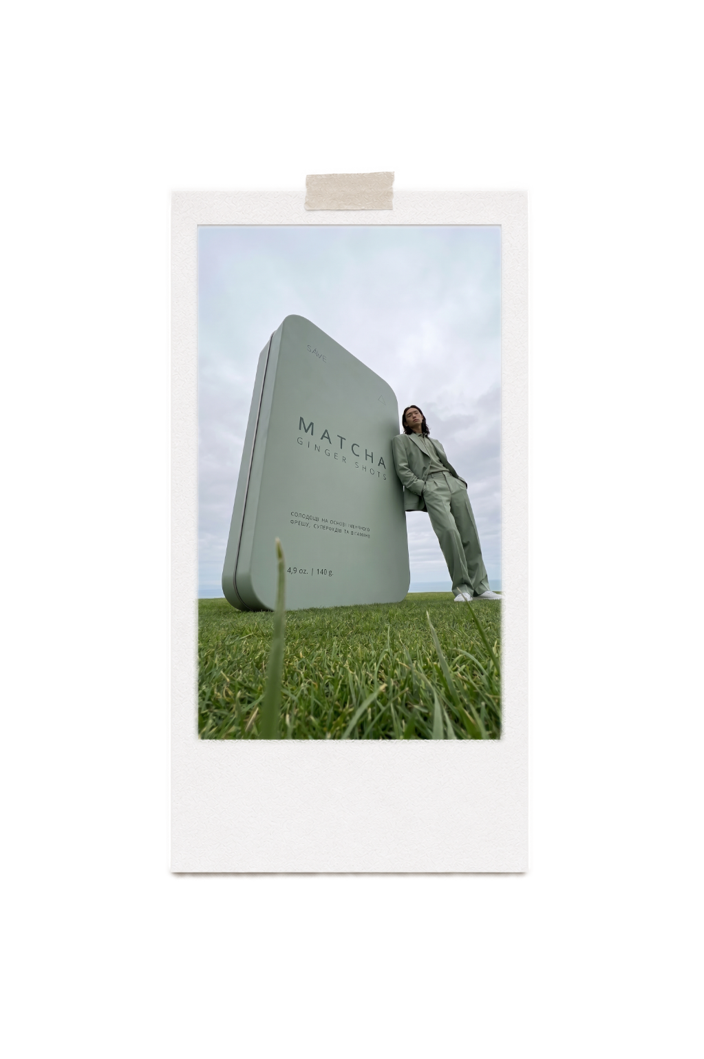
The packaging was completely reimagined to transition SÁVE from a standard functional product to an object of desire. Moving away from conventional paper boxes, we introduced a sleek, enduring metallic form that elevates the daily wellness ritual.
Rooted in premium minimalism, the design utilizes matte-finished metal tins with sophisticated, restrained typography. The muted, earth-toned palette provides a distinct visual identity for each flavor while ensuring a cohesive, tactile presence on the shelf.
The visual presentation strips away the noise, focusing on pure form, soft shadows, and organic textures. The photography contrasts the clean, architectural lines of the new tins with the raw, natural essence of the superfood elements inside.

packaging design
concept + form
materiality
product photography


The visual presentation strips away the noise, focusing on pure form, soft shadows, and organic textures. The photography contrasts the clean, architectural lines of the new tins with the raw, natural essence of the superfood elements inside.
Rooted in premium minimalism, the design utilizes matte-finished metal tins with sophisticated, restrained typography. The muted, earth-toned palette provides a distinct visual identity for each flavor while ensuring a cohesive, tactile presence on the shelf.
The packaging was completely reimagined to transition SÁVE from a standard functional product to an object of desire. Moving away from conventional paper boxes, we introduced a sleek, enduring metallic form that elevates the daily wellness ritual.
packaging design
concept + form
materiality
product photography
ai models
art direction
outfits
characters
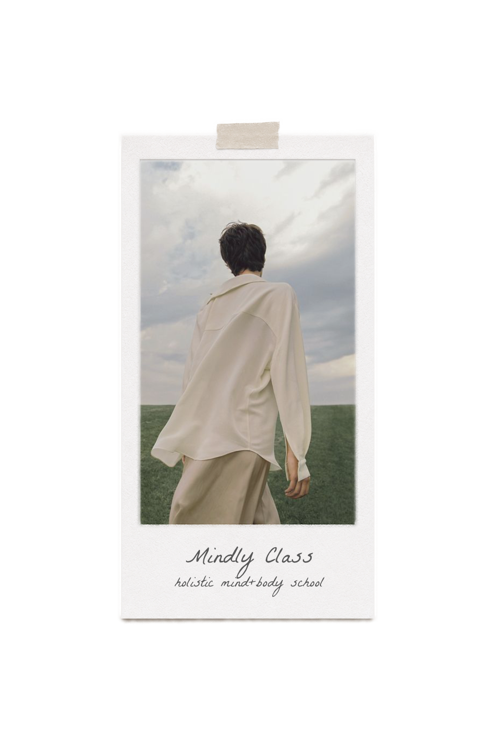
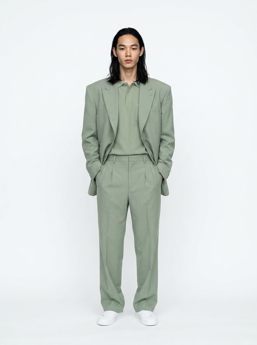
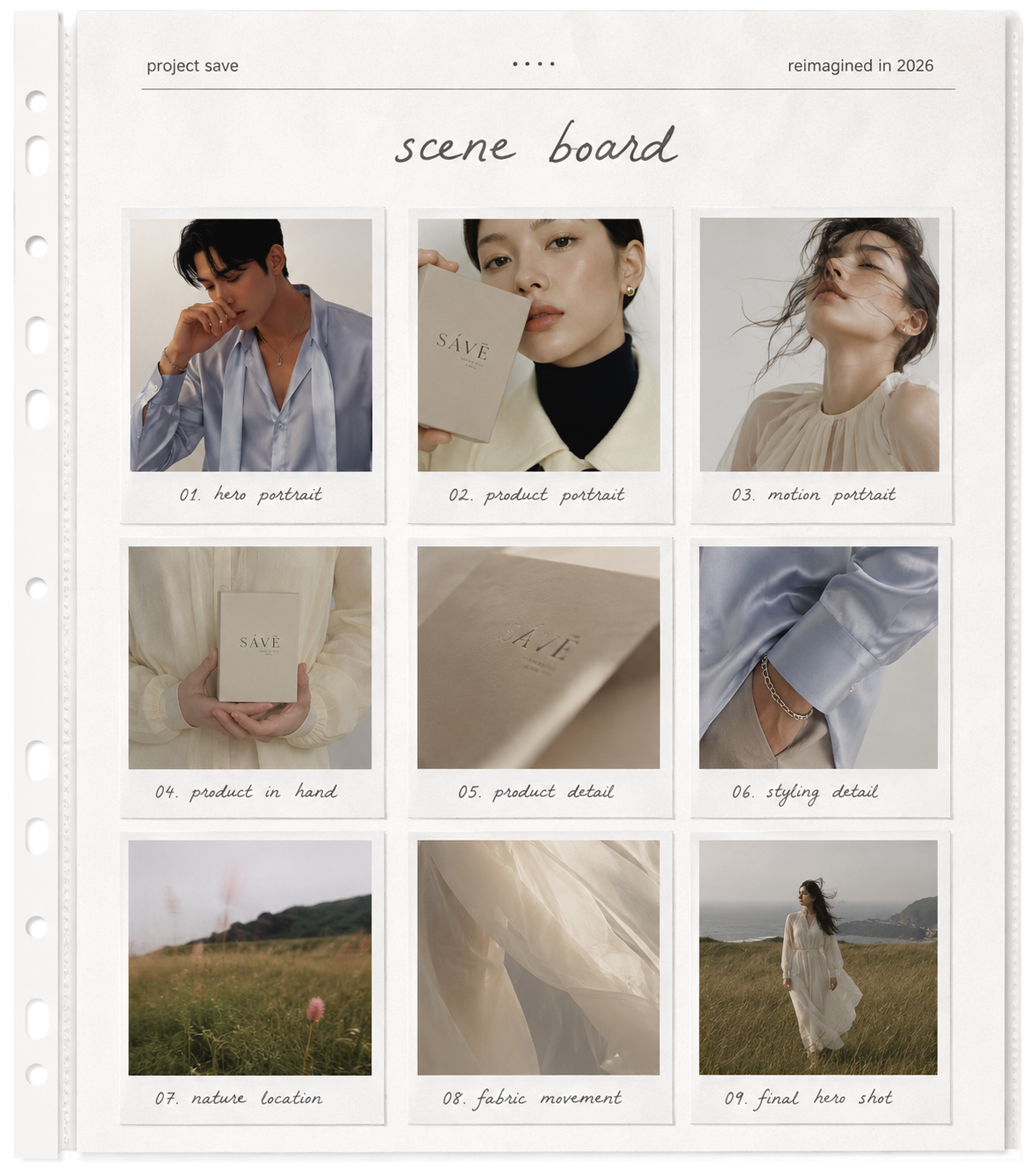
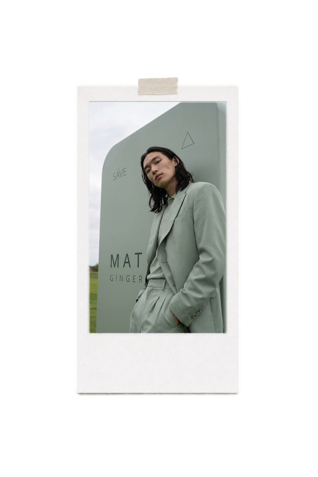
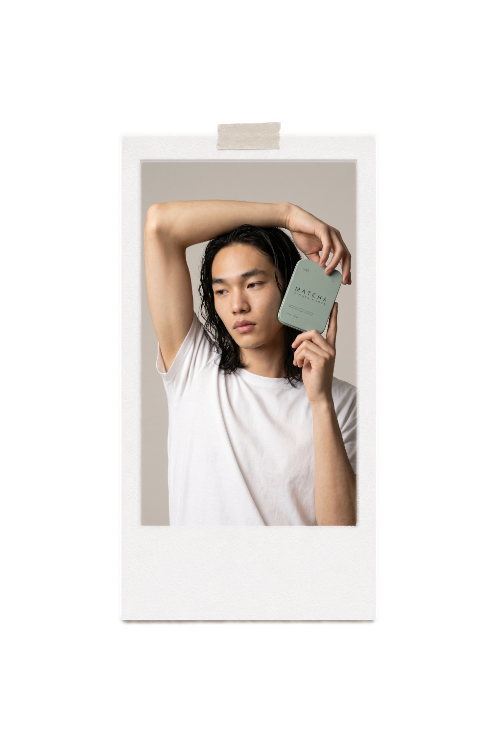
As part of the art direction for the brand's advertising campaign, we conceptualized a minimalist AI high-fashion photoshoot.
The wardrobe was meticulously curated with one strict visual rule: the color of each model’s garment perfectly matches the exact shade of the corresponding product packaging box, creating a seamless link between the physical product and the digital campaign.
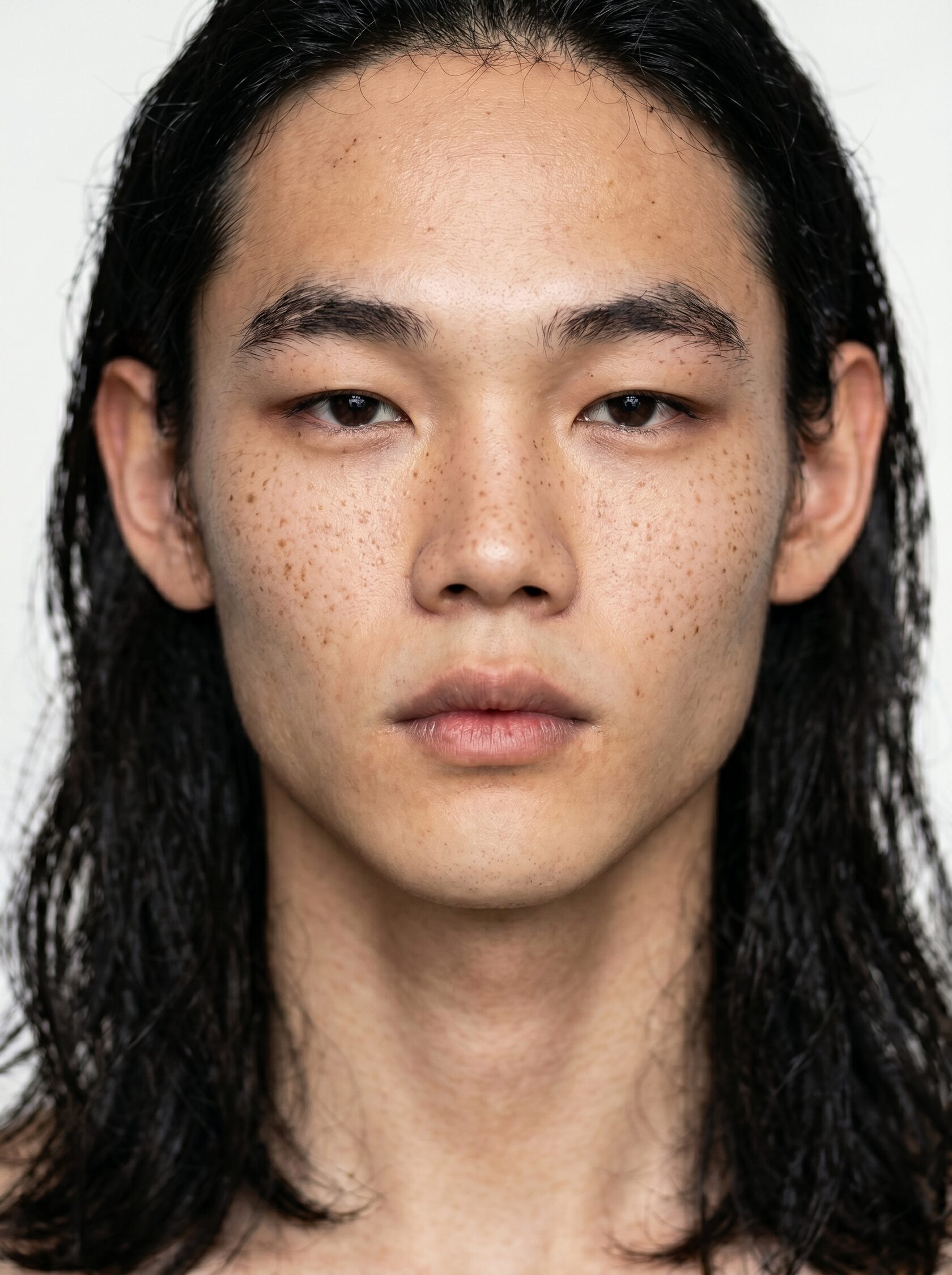
To emphasize the multifaceted identity of the brand’s consumers, we selected a highly diverse cast of both men and women across various typologies. This inclusivity visualizes the core philosophy of the product—the "human of the future." It is an identity completely free from the traditional boundaries of gender or nationality, united instead by a limitless, modern aesthetic.
The wardrobe was meticulously curated with one strict visual rule: the color of each model’s garment perfectly matches the exact shade of the corresponding product packaging box, creating a seamless link between the physical product and the digital campaign.
To emphasize the multifaceted identity of the brand’s consumers, we selected a highly diverse cast of both men and women across various typologies. This inclusivity visualizes the core philosophy of the product—the "human of the future." It is an identity completely free from the traditional boundaries of gender or nationality, united instead by a limitless, modern aesthetic.
ai models
art direction
outfits
characters
To emphasize the multifaceted identity of the brand’s consumers, we selected a highly diverse cast of both men and women across various typologies.
This inclusivity visualizes the core philosophy of the product—the "human of the future." It is an identity completely free from the traditional boundaries of gender or nationality, united instead by a limitless, modern aesthetic.
This inclusivity visualizes the core philosophy of the product—the "human of the future." It is an identity completely free from the traditional boundaries of gender or nationality, united instead by a limitless, modern aesthetic.
The wardrobe was meticulously curated with one strict visual rule: the color of each model’s garment perfectly matches the exact shade of the corresponding product packaging box, creating a seamless link between the physical product and the digital campaign.
As part of the art direction for the brand's advertising campaign, we conceptualized a minimalist AI high-fashion photoshoot.
art direction
character
styling
location
2 stage
1 stage
3 stage
photoshoot
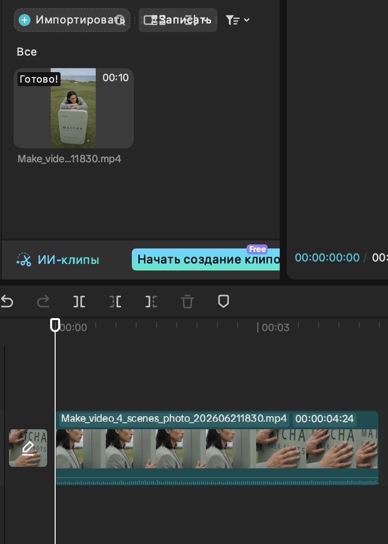
video
production
production
photo editing
creative ai campain

result
video editing
SÁVE is a premium superfood brand born from a profound respect for the natural world and the human body.
At its core lies a simple but powerful manifesto: to nourish, protect, and consciously preserve the delicate balance between our health and the planet's future.
At its core lies a simple but powerful manifesto: to nourish, protect, and consciously preserve the delicate balance between our health and the planet's future.


brand discovery
campaign concept
mood board

result
video editing
art direction
character
styling
location
2 stage
1 stage
3 stage
photoshoot
video
production
production
photo editing
creative ai campain
SÁVE is a premium superfood brand born from a profound respect for the natural world and the human body.
At its core lies a simple but powerful manifesto: to nourish, protect, and consciously preserve the delicate balance between our health and the planet's future.
At its core lies a simple but powerful manifesto: to nourish, protect, and consciously preserve the delicate balance between our health and the planet's future.
brand discovery
campaign concept
mood board
model 1
pineapple
Pineapple
the flavor profile
art direction
A solar infusion designed to awaken the senses and elevate daily vitality. This blend masterfully pairs the fiery, grounding warmth of a classic ginger shot with the vibrant sweetness of premium pineapple powder and the tart, nutrient-dense essence of sea buckthorn.
Infused with essential vitamins and powerful superfoods, it serves as an immediate catalyst for natural energy, clarity, and an elevated mood.
Infused with essential vitamins and powerful superfoods, it serves as an immediate catalyst for natural energy, clarity, and an elevated mood.
The art direction for the Pineapple campaign is rooted in a strict monochromatic narrative and sun-drenched minimalism.
Set against the architectural, raw textures of white sand dunes, the visual language relies entirely on crisp natural sunlight and deep shadows to evoke a sense of serene warmth.
The model’s modern tailored silhouette flawlessly echoes the exact pastel yellow hue of the matte metallic tin, creating an inseparable fusion of product, individual, and environment.

model 1
pineapple
Pineapple
the flavor profile
art direction
A solar infusion designed to awaken the senses and elevate daily vitality.
This blend masterfully pairs the fiery, grounding warmth of a classic ginger shot with the vibrant sweetness of premium pineapple powder and the tart, nutrient-dense essence of sea buckthorn.
Infused with essential vitamins and powerful superfoods, it serves as an immediate catalyst for natural energy, clarity, and an elevated mood.
The art direction for the Pineapple campaign is rooted in a strict monochromatic narrative and sun-drenched minimalism.
Set against the architectural, raw textures of white sand dunes, the visual language relies entirely on crisp natural sunlight and deep shadows to evoke a sense of serene warmth.
The model’s modern tailored silhouette flawlessly echoes the exact pastel yellow hue of the matte metallic tin, creating an inseparable fusion of product, individual, and environment.
Set against the architectural, raw textures of white sand dunes, the visual language relies entirely on crisp natural sunlight and deep shadows to evoke a sense of serene warmth.
The model’s modern tailored silhouette flawlessly echoes the exact pastel yellow hue of the matte metallic tin, creating an inseparable fusion of product, individual, and environment.
цитата стих рукописным шрифтом
описание
описание
1 услуга - создание лого
2 услуга - создание упаковки продукта
описание
главное видео
мудборд
результат
фото как на доске приколоты
видео1
видео2
видео3

3 услуга - медиа продакшн
лого на мокапах

ukraine
2020
2020
project resume
01
What if we did branding for this project in 2026?


цитата стих рукописным шрифтом
описание
описание
1 услуга - создание лого
2 услуга - создание упаковки продукта
описание
главное видео
мудборд
результат
фото как на доске приколоты
видео1
видео2
видео3
3 услуга - медиа продакшн
лого на мокапах
ukraine
2020
2020
project resume
01
What if we did branding for this project in 2026?
model 2
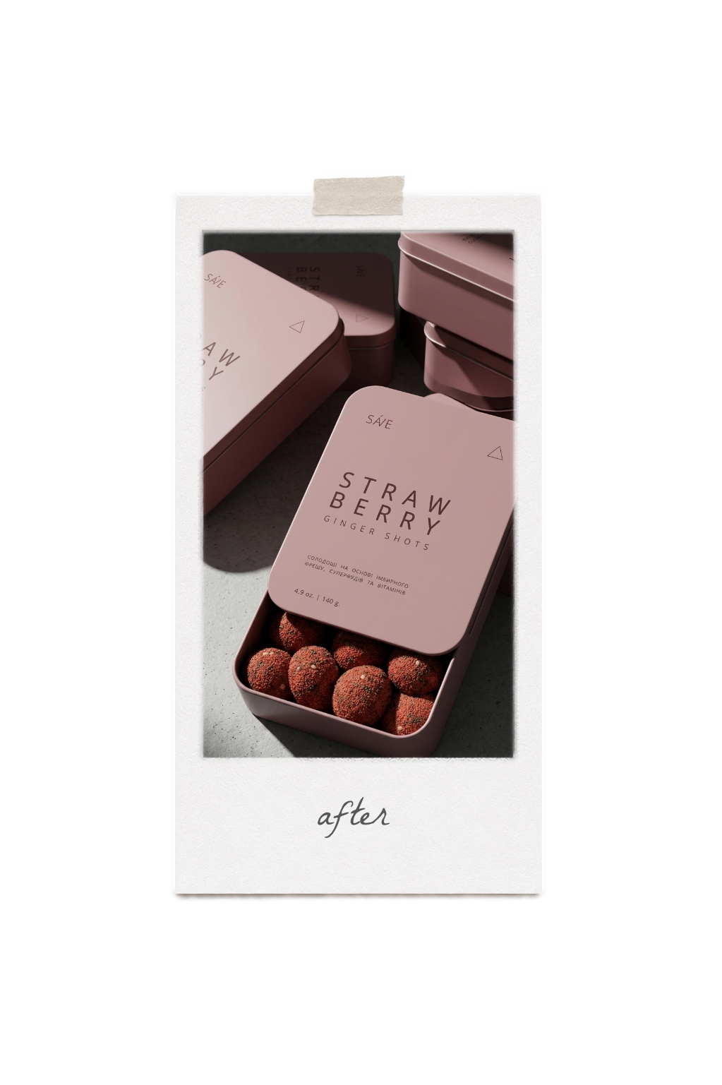
strawberry
Strawberry
the flavor profile
art direction
A delicate yet empowering blend designed to awaken inner harmony and ignite natural vitality. This composition masterfully infuses the sharp, invigorating punch of classic ginger with the soft, nostalgic sweetness of organic strawberry powder and the texturized, nutrient-dense power of chia seeds.
The art direction for the Strawberry campaign embraces poetic coastal romanticism and exquisite tactile softness. Moving between the moody, cinematic grey of an overcast pebble beach and the ethereal, pastel violet hues of a seaside sunset, the visual narrative evokes a deeply emotional atmosphere.
The casting focuses on raw, authentic beauty, where the model’s luminous skin and striking copper-red hair create a breathtaking organic contrast against the monochromatic pastel pink wardrobe and matte metallic tin. The composition beautifully balances fluid, romantic silhouettes with clean, structural forms.
The casting focuses on raw, authentic beauty, where the model’s luminous skin and striking copper-red hair create a breathtaking organic contrast against the monochromatic pastel pink wardrobe and matte metallic tin. The composition beautifully balances fluid, romantic silhouettes with clean, structural forms.
Strawberry
the flavor profile
art direction
A delicate yet empowering blend designed to awaken inner harmony and ignite natural vitality.
This composition masterfully infuses the sharp, invigorating punch of classic ginger with the soft, nostalgic sweetness of organic strawberry powder and the texturized, nutrient-dense power of chia seeds.
This composition masterfully infuses the sharp, invigorating punch of classic ginger with the soft, nostalgic sweetness of organic strawberry powder and the texturized, nutrient-dense power of chia seeds.
The art direction for the Strawberry campaign embraces poetic coastal romanticism and exquisite tactile softness. Moving between the moody, cinematic grey of an overcast pebble beach and the ethereal, pastel violet hues of a seaside sunset, the visual narrative evokes a deeply emotional atmosphere.
The casting focuses on raw, authentic beauty, where the model’s luminous skin and striking copper-red hair create a breathtaking organic contrast against the monochromatic pastel pink wardrobe and matte metallic tin. The composition beautifully balances fluid, romantic silhouettes with clean, structural forms.
The casting focuses on raw, authentic beauty, where the model’s luminous skin and striking copper-red hair create a breathtaking organic contrast against the monochromatic pastel pink wardrobe and matte metallic tin. The composition beautifully balances fluid, romantic silhouettes with clean, structural forms.
model 2
strawberry
цитата стих рукописным шрифтом
описание
описание
1 услуга - создание лого
2 услуга - создание упаковки продукта
описание
главное видео
мудборд
результат
фото как на доске приколоты
видео1
видео2
видео3
3 услуга - медиа продакшн
лого на мокапах
project resume
01

The meaning of human existence is seen only in unity with nature.
What if we did branding for this project in 2026?


цитата стих рукописным шрифтом
описание
описание
1 услуга - создание лого
2 услуга - создание упаковки продукта
описание
главное видео
мудборд
результат
фото как на доске приколоты
видео1
видео2
видео3
3 услуга - медиа продакшн
лого на мокапах
project resume
01
The meaning of human existence is seen only in unity with nature.
What if we did branding for this project in 2026?